
 English
 Portuguese
Design system
Datum
The design system behind this site: tokens, seasons and components that give everything I build the same personality, from the portfolio to the tools.
In numbers
- Components
- 14
- Primitives and general patterns, one story per state.
- Storybook stories
- 69
- Each one runs through axe, the automated accessibility check.
- Seasons
- 8
- The accent color changes with the date, from Carnival to Christmas.
- Contrast
- WCAG AA
- On every text and background pair: the tests fail the build below 4.5:1.
- Total Blocking Time
- < 100 msdown from 1,424 ms
- Home page in Lighthouse, mobile profile.
- Lighthouse Performance
- 90+up from 54
- Home page, mobile profile.
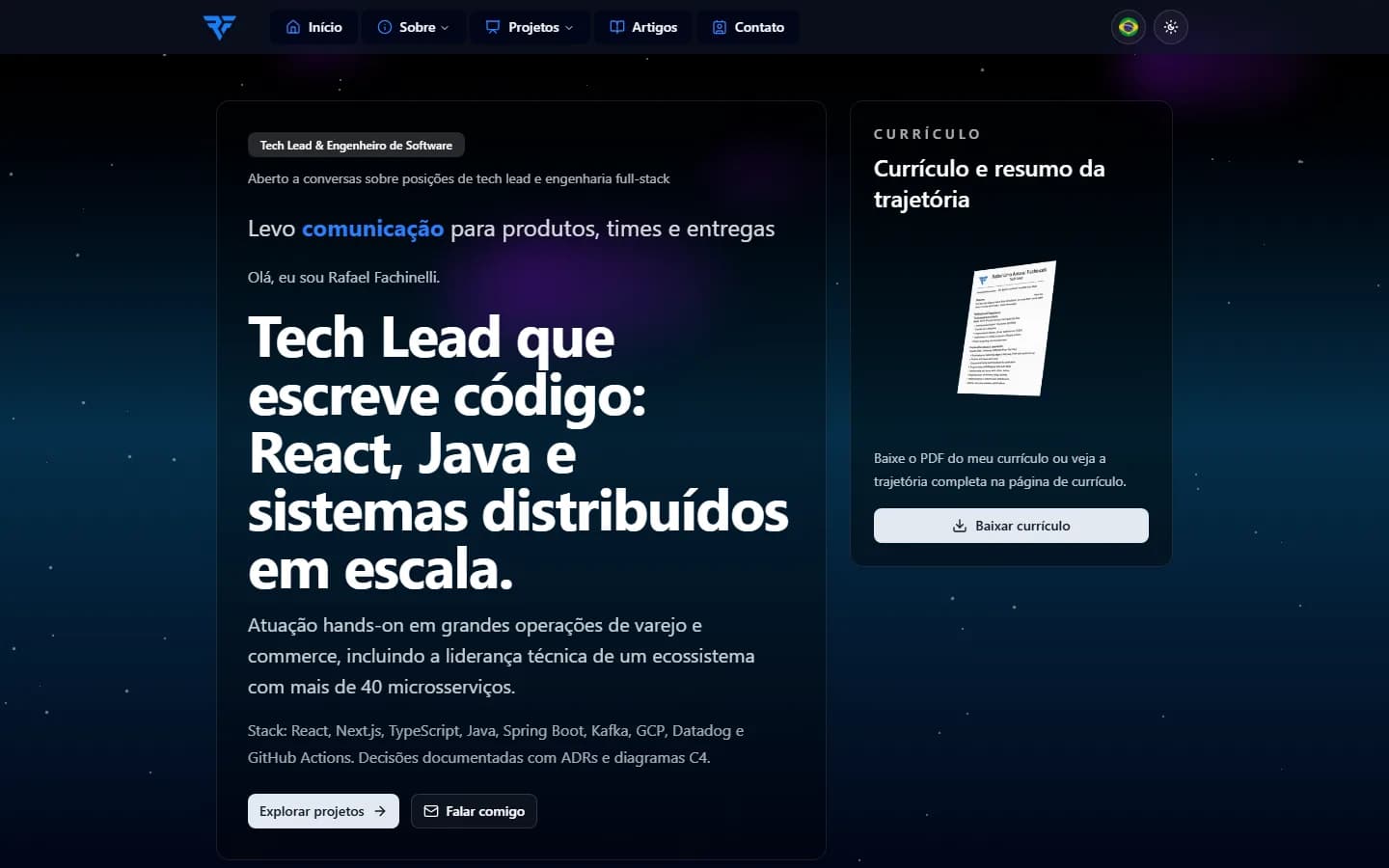
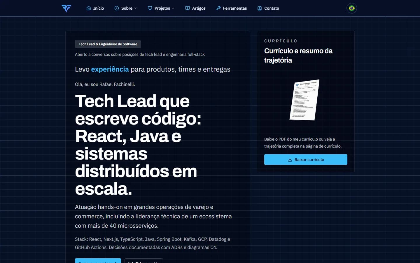
Before and after
The same home page on the same screen. Before, stock shadcn components with no personality and a background of stars animated in JavaScript that froze phones. After, the Blueprint drafting board, in the color of the season.
One piece, three seasons
The same card in the base season, at Halloween and at Christmas. Only the accent changes; layout and contrast stay the same, and the site switches by date on its own.

What's inside
Tokens
Palette, dark theme, type, a 4 px spacing scale and a 2 px radius in the W3C DTCG format. One source builds the CSS variables, the Tailwind 4 theme and a TypeScript module.
Components
Button, Badge, Card, Field, Select, RadioGroup, Sheet and more, on Radix and shadcn/ui, with the Blueprint personality layer on top.
Seasons
The theme switches by date before the first paint, even though pages are cached for a year.
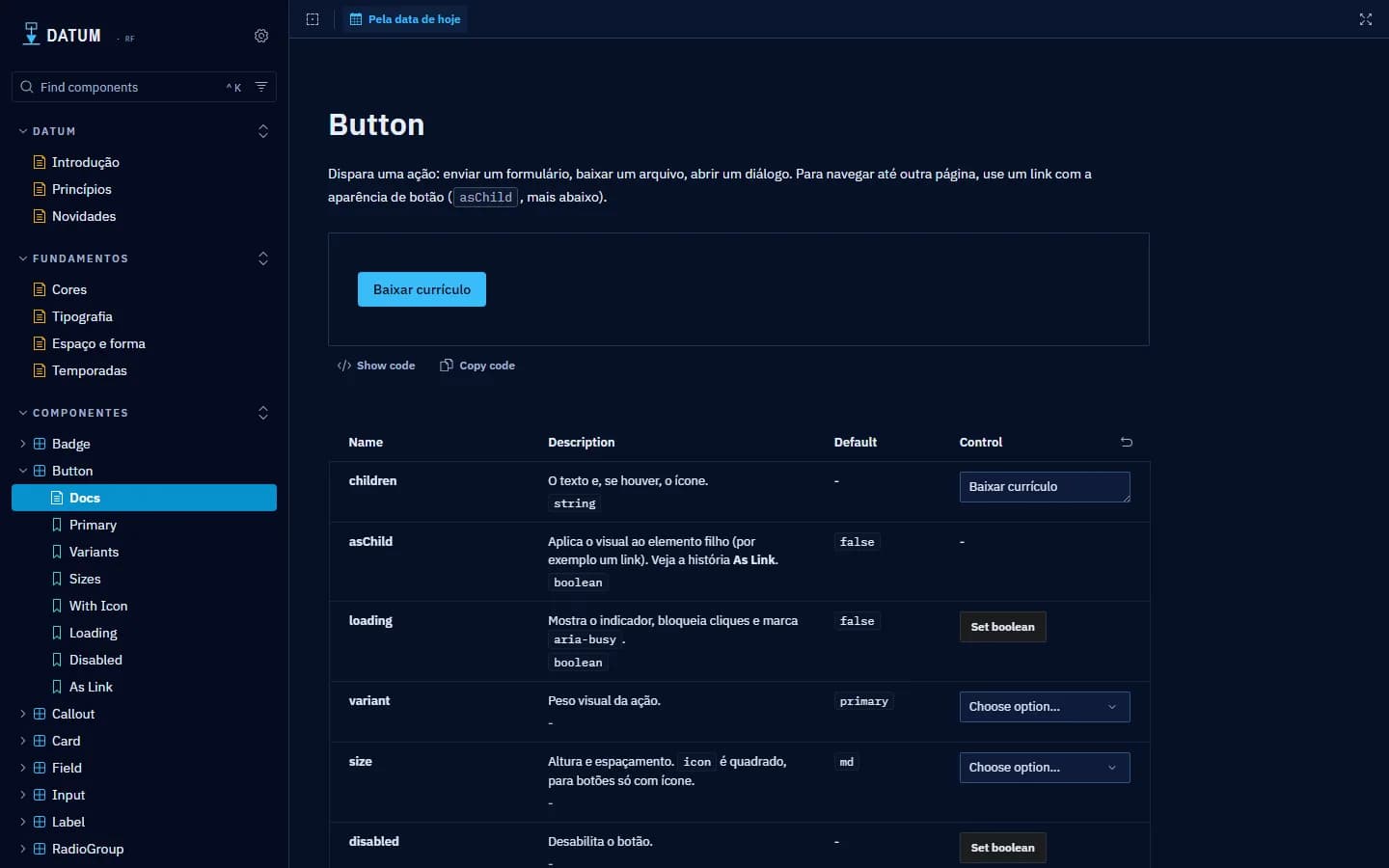
Storybook
Foundations, components and release notes, with when to use each variant and an accessibility check on every story.
Stack
- W3C DTCG
- Tailwind CSS 4
- Radix UI
- shadcn/ui
- React 19
- TypeScript
- Storybook 10
- Vitest
Inside Datum
Every component is in the Storybook, and the code is open on GitHub.