
 English
 Portuguese
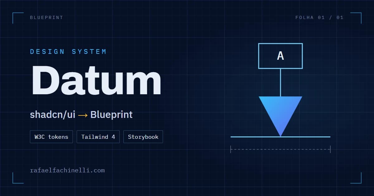
Good-looking components with no personality: how I built Datum, the design system of my portfolio
By Rafael Fachinelli · · 6 min read
Quick summary
- A design system is not about team size: it is about not deciding everything again for each thing you build.
- I started from shadcn/ui because it hands you the component code to evolve, instead of a black box in
node_modules. - The important rules defend themselves: contrast below WCAG AA fails the build.
- AI wrote fast; what made it come out right was knowing what to ask for.
My old site looked good. Dark, modern, with well-assembled shadcn/ui components. The problem is that it could have been anyone’s site: the buttons, cards and menus were exactly what comes with the install, with no work on top to say who I am. And it froze phones: the background had about a hundred stars animated in JavaScript, forever.
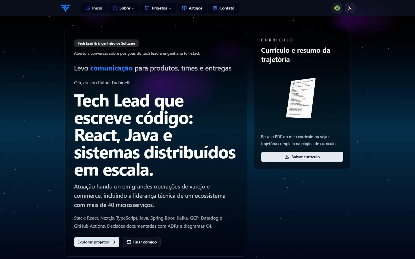
Datum was born to fix both. It is the design system of my portfolio: tokens, seasons and components that give everything I build the same personality, from the site to the tools.
Why a design system for one person
It sounds like a big-company thing, but a design system is not about team size. It is about not deciding everything again. With it, everything I build, a page or a tool, starts out knowing the color, the spacing, the type and the message I want to send. I stop asking "what should this look like?" and go straight to the problem.
There is another side: whoever finds my work, on the site, in a tool or in a post, recognizes the same personality everywhere. A consistent visual identity is what makes people read a brand as a personality, not as a pile of screens.
Why I started from shadcn (and not MUI)
Libraries like MUI, Chakra and Mantine ship ready components inside node_modules. They work well, but the component lives in a black box: you can configure it, not evolve it. shadcn/ui does the opposite and copies the component’s source code into your project. Its own docs put it this way: it is not a component library, it is how you build yours.
That settled the base. Datum’s components start from shadcn and Radix, which handles keyboard, focus and screen readers, and get a personality layer on top. When a component needs to change, I change its code instead of fighting it.
One source for color, space and type
The tokens, the base decisions of the system, live in JSON files in the format of the W3C Design Tokens Community Group, which reached its first stable version in 2025. It is not an official W3C standard, but it is an open, tool-neutral format, and that is what matters: color, type, a 4 px spacing scale and a 2 px radius described once.
"color": {
  "board": { "$value": "{palette.navy.900}", "$description": "Page background, the drafting board" },
  "ink": { "$value": "{palette.slate.50}", "$description": "Main text" },
  "line": { "$value": "#7dd3fc24", "$description": "Hairline borders" }
}
A build turns those files into three outputs: CSS variables, a Tailwind 4 theme and a TypeScript module. Components use only the semantic names (bg-board, text-ink), never the raw color.
The personality: a drafting board
Before any code, I wrote the brand principles. The central one is to care for what nobody sees: the inside of the work gets the same attention as the outside. With that, I compared three visual directions: Blueprint, Órbita and Constelação. Blueprint won, a drafting board with a faint grid, dimension marks and monospaced notes, because it shows exactly that inside.
The name comes from technical drawing too. On a drawing, the datum is the reference every dimension is measured from. Dimensions are not measured from each other; they all start at the same point, and that is what makes the part fit. A design system plays the same role for color, space and type.
Seasons: the same site, in the color of the date
Datum has eight seasons: the base one, New Year, Carnival, Easter, Festa Junina, Programmer’s Day, Halloween and Christmas. Only the accent color and the logo gradient change. Layout, contrast and rules stay the same.

The technical detail: pages are static and cached for a year, so choosing the season at build time would freeze the site on the day it was published. A small script in the <head> reads the visitor’s date and sets the season before the first paint, with no flash.
Rules that defend themselves
A rule that depends on someone remembering it gets lost one day. In Datum, the important ones live in code:
- Contrast. Every text and background pair must pass WCAG AA (4.5:1), including the color of each season. The tests fail the build if a new token breaks it.
- General pieces only. Datum is public, so only what would make sense in any project goes in. The article card and the home metrics are built in the site, from Datum pieces, and never move into it.
- Performance is part of the brand. No continuous JavaScript animation. With reduced motion turned on, decorative motion stops.
AI executing, me orchestrating
I built Datum with AI agents, and the work that mattered most was steering. I set the technologies (shadcn as the base, the W3C format for tokens, Storybook for the docs), the personality and the rules of the system, and asked for three directions to choose from instead of taking the first one.
It was not my first design system. I contributed to Mozaic, the design system of the ADEO group, and built the one for Castle Raiders. That background made the difference: I knew which decisions to make and in what order, and the agent sped up the writing. From the first token to the whole site using the components took three days, with no major rework. If I started again, I would do it the same way.
What still went wrong
Two bugs only showed up with people using it:
- The
asChildthat crashed the page. In the Storybook, turningasChildon in the controls panel crashed the Button example:asChildpasses the styles to the child element, and there the child was plain text. The component was right; the panel offered a control that could not work on its own. - The loading spinner that stopped. With Windows’ performance mode, the system asks for reduced motion, and the button stopped its spinner. But the spinner is not decoration: it shows something is happening. Now it keeps turning, slower.
Both became written rules and entries on the Storybook’s release notes page.
The numbers
Datum came with a performance budget, and the change showed. Part of it came from swapping the animated background for the drafting grid, which is CSS only; part from rendering pages on the server and cutting first-load JavaScript. On the home page, in Lighthouse with the mobile profile:
- Performance: from 54 to 90 or more.
- Total Blocking Time: from 1,424 ms to under 100 ms.
And the system itself: 14 components, 69 Storybook stories, each checked with axe, 8 seasons and AA contrast on every color pair.
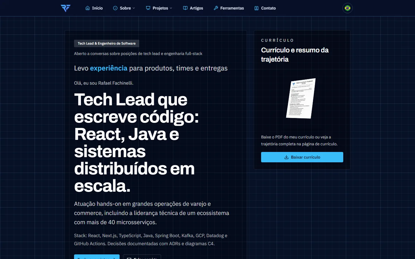
Everything is open: the components in the Datum Storybook and the code on GitHub.
Lessons
- A design system is for not deciding everything again: it pays off even for one person.
- Pick a base that hands you the component code when you want personality, not just configuration.
- Describe color, space and type once, as tokens, and generate the rest from them.
- Put the important rules in code: a contrast test remembers for you.
- With AI, the result depends on knowing what to ask for: technologies, rules and options to choose from.
Frequently asked questions
- Is it worth building a design system for a personal project?
- It is when your brand shows up in more than one place, like a site, tools and posts. You stop deciding color, spacing and type again for each piece, and every piece keeps the same personality.
- Is shadcn/ui a component library?
- Not in the traditional sense. It copies the source code of each component into your project, so you can change it and build new components from it instead of depending on a closed package in node_modules.
- What are design tokens?
- They are the base decisions of a design system, such as colors, fonts, spacing and radii, stored in a neutral format. The W3C Design Tokens Community Group format lets you generate CSS variables, Tailwind themes and code for other platforms from them.
- How do you guarantee accessible contrast in a design system?
- Test every text and background pair against WCAG AA (4.5:1) automatically and make the build fail when a pair does not pass. That way a new token cannot break accessibility without anyone noticing.
References
Want to talk about the design system of your product?
Talk to me